I broke the Cardinal Rule! Oh snap! I know the rule. I know better. I know how to prevent what happened. I could give you every reason, every excuse as to why it happened but that won't help. That won't bring back the day. The hike. The fantastic photos... probably the best photos ever taken... and of course they got even better!! when I realized... I forgot the stinking card for my camera!!! Battery....check. Card....check. But wait, I'll switch cards with Rick's camera that he was taking to Phoebe's game so I had the bigger Gig card (since I'm known to take a load of pics)....Made the switch but forgot to put the 'big' card in my camera. My mistake.... not to take a test shot before leaving. Make sure your camera is functioning. Second mistake. NO BACK-UP card!!
So a fantastic day of climbing Vulture Peak with Aunt Laurie and my daughter, Sarah, is now in the computer bank of my brain. Not so trust worthy these days but I keep replaying a few of the shots I took that briefly showed on my LCD, in my head. I particularly liked the one of Laurie and Sarah running by me. I shot up from the ground and the sun was making 'sunflares' through some sahuaros, the sky deep blue, they looked strong. I think Nike would have liked it. :) hahaha I don't have 'the dope' climbing the west side of the peak nor would I have had it if we would have had to scrape him up from the ground. There isn't the spectacular vista at the top recorded with 'The Posers'...Laurie and Sarah or the race to the bottom. I just have my brain bank and a sore back from lugging a camera for no reason.
LESSON: Check everything. Charge your batteries. Have a spare. Bring extra cards. Make sure your camera functions before you leave. How many times have I heard this in classes, from photographers?!!
It will happen to everyone eventually.... just make sure you cover your steps so it doesn't happen when it matters most, like a rare trip from your sister.
My computer is down. I'm at the Apple Store as I type. I won't be able to get pictures printed until Wednesday....maybe. I'm so sorry our first week has started out this way. Hopefully it will give you more time to vote since no one has yet. So Vote away!! I'll be able to check my email.
Keep shooting!
Mrs. B
Sunday, January 31, 2010
Friday, January 29, 2010
January 28th: Review, slow-down, practice what we've learned
"You don't take a photograph, you make it." -- Ansel Adams
Stop taking Pictures, start creating them!
Topic #1 Composition:
Look for pattern-filled compositions or create them. Shoot from all angles; above, below, behind, beside, etc.
Topic #2 The Exposure Triangle:
Continue to play with the Basic Mode Zones on your camera.
ASSIGNMENT: send me one picture with patterns, two showing DOF (depth of field, one with a narrow dof and one with a big dof), 2 or 3 for 'Picture of the Week'.
Please be sure to label which pictures are for assignments and which are for 'Pictures of the Week'. If I have to use my ESP powers, they have been known to be faulty.

This photo by RACHAEL MOORE, has large DOF. Phoebe is focused in the foreground and London's Parliament and city is focused in the background. Nice job of off setting the subject and using the Rule of Thirds.

This river lily has a narrow DOF. The background is blurred to make the subject stand out. The lily and bee are the only things in focus.
Practice these two techniques using AV and TV modes.
Other blogs to check out. The best way to better your creativity is to check out others creativity.
Photo of the Week-week 1
Sorry for the late post. I've been busy with my sis, Aunt Laurie. Not too many entries this week, but some good ones!! Hope you all catch on. Please vote!
2.
3.
4.
5.
1.

2.

3.

4.

5.

Well done. Vote by number. Just leave a comment... 'I vote for #?' If you might know who someone's is, please don't give it away. Keep it anonymous. Thanks and good luck everyone!!
Monday, January 25, 2010
January 21st, DOF, Basic Mode Zones (AV,TV)
Topic #1: Composition
Horizon vs No Horizon: Do you ever NOT want to have
a horizon in a landscape?
answer: When you want to have the emphasis on one subject.
Check out the links above and remember 'no horizon' is
not limited to water.


that distance are sharply focused. Subjects that are not at the
same distance are out of focus and theoretically are not sharp.
However, since human eyes cannot distinguish very small degree
of unsharpness, some subjects that are in front of and behind the
sharply focused subjects can still appear sharp. The zone of
acceptable sharpness is referred to as the depth of field. Thus,
increasing the depth of field increases the sharpness of an image.
We can use smaller apertures for increasing the depth of field.
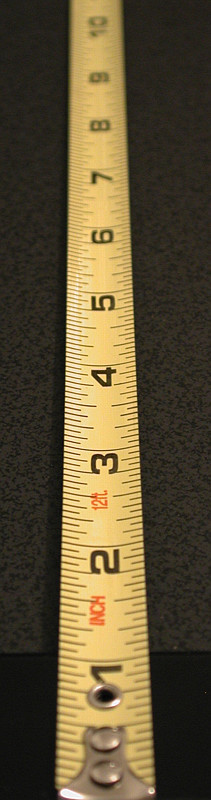
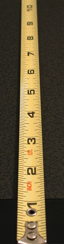
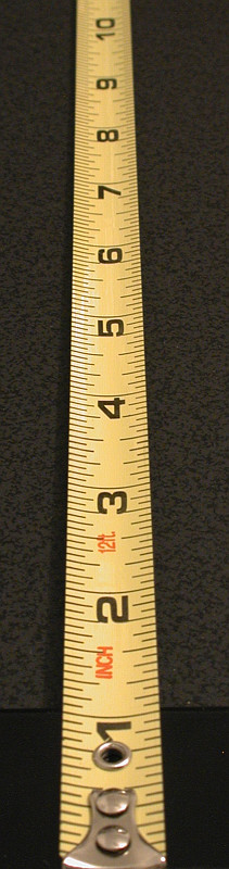
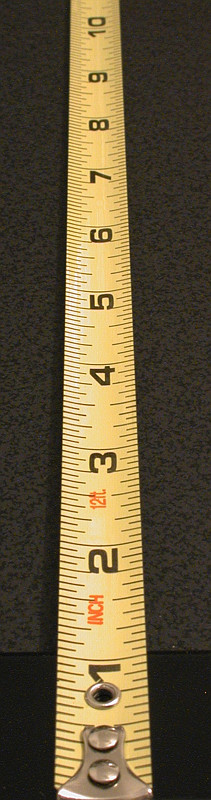
The following shows an example. The lens focuses at the middle
between the 3 inch and 4 inch marks. Thus, the 3 inch and 4 inch
marks are sharp in all images. The 5 inch mark is not very sharp at
F3.2, and is improved as the lens closes down to F3.6. Then, it
becomes sharp in all subsequent images. The 6 inch and 7 inch
marks are not sharp until F5.0 and F6.4, respectively. The 8 inch
mark becomes reasonably sharp when the lens closes down to F8.0.
The 9 inch and 10 inch marks are not sharp in all images; but, they
become sharper as the lens closes down. For the foreground, the 2
inch mark is acceptable at F3.2 and becomes "focused" at F4.0. The
1 inch mark is not sharp until F5.6, and the lead of the ruler
becomes reasonably sharp at F7.1. As you can see, the range of
sharpness (i.e., depth of field) gets larger as the aperture gets
smaller. Therefore, use a smaller aperture if a greater depth of field
is needed. Please check the Aperture-Priority Mode to know more
about the use of aperture and its impact on depth of field.
Keep snapping. Carry your camera every
where! Oh we love to SNAP.
Horizon vs No Horizon: Do you ever NOT want to have
a horizon in a landscape?
answer: When you want to have the emphasis on one subject.
Check out the links above and remember 'no horizon' is
not limited to water.

Marejle Jones and Danielle Morgan, roping teammates, are going after
their steer in the HS Rodeo.
Topic #2: The Exposure Triangle
ISO: measure of the camera sensor's sensitivity to light
shutter speed: The amount of time the shutter is open
aperture: The size of the opening in the lens when a picture
is taken
is taken
For this topic I am going to refer you to the link. There is no
sense in reinventing the triangle when they have a nice diagram
all set up. Besides, I have no idea how to draw one here :) Be
sure to follow all the links on that page.
sense in reinventing the triangle when they have a nice diagram
all set up. Besides, I have no idea how to draw one here :) Be
sure to follow all the links on that page.
Topic #3: Basic Zone Modes ...watch this video on zone modes.
It uses the Canon EOS as an example but the principles are the
same for all cameras, the symbols might be a bit different.
It uses the Canon EOS as an example but the principles are the
same for all cameras, the symbols might be a bit different.
Portrait- blurs the background (opens the aperture)
Landscape- everything in focus, big 'Depth of Field' (small aperture)
Here is a quick look at 'DOF'...
Depth of Field
Basics
When a lens focuses on a subject at a distance, all subjects atthat distance are sharply focused. Subjects that are not at the
same distance are out of focus and theoretically are not sharp.
However, since human eyes cannot distinguish very small degree
of unsharpness, some subjects that are in front of and behind the
sharply focused subjects can still appear sharp. The zone of
acceptable sharpness is referred to as the depth of field. Thus,
increasing the depth of field increases the sharpness of an image.
We can use smaller apertures for increasing the depth of field.
The following shows an example. The lens focuses at the middle
between the 3 inch and 4 inch marks. Thus, the 3 inch and 4 inch
marks are sharp in all images. The 5 inch mark is not very sharp at
F3.2, and is improved as the lens closes down to F3.6. Then, it
becomes sharp in all subsequent images. The 6 inch and 7 inch
marks are not sharp until F5.0 and F6.4, respectively. The 8 inch
mark becomes reasonably sharp when the lens closes down to F8.0.
The 9 inch and 10 inch marks are not sharp in all images; but, they
become sharper as the lens closes down. For the foreground, the 2
inch mark is acceptable at F3.2 and becomes "focused" at F4.0. The
1 inch mark is not sharp until F5.6, and the lead of the ruler
becomes reasonably sharp at F7.1. As you can see, the range of
sharpness (i.e., depth of field) gets larger as the aperture gets
smaller. Therefore, use a smaller aperture if a greater depth of field
is needed. Please check the Aperture-Priority Mode to know more
about the use of aperture and its impact on depth of field.
 |  |  |  |  |
| F3.2 | F3.6 | F4.0 | F4.5 | F5.0 |
 |  |  |  |  |
| F5.6 | F6.4 | F7.1 | F8.0 | F9.0 |
| Click on the image to see a larger one Macro- close-ups, a simple background make things stand out Moving Subjects- telephoto lenses and auto focus best Night- use a tripod and/or a stable surface.... Trick: if you have low light conditions and not a tripod, use your arms braced against your body, or prop the camera on your knee. Put it in rapid fire mode. The first shot will take the shake of your finger press and will be blurry. The next should be better as the initial shake is past. While not perfect it helps. TV: Shutter-Priority: you set the shutter speed and the camera sets the aperture matching the brightness of the subject. A fast shutter can freeze water droplets or a slower one can blur them giving them the feeling of motion.  In this picture I have a longer shutter allowing a longer time to gather light, creating the water to have a softer streaky look.  Here there is a fast shutter capturing the individual water droplets. AV: Aperture Priority: you set the aperture and the camera sets the shutter speed. A large aperture, f2.8= blurred background. Small aperture, f22= focused background (large DOF)  I don't remember my settings for this picture but it does demonstrate DOF. My dog, Angie is in focus in the foreground as she watches the construction in the river that is also in focus, a large Depth Of Field.  Again, I don't remember my exact settings, except I opened the aperture to blur the background (no horizon to focus on the subject) and got the color of other flowers to create an abstract feel. Assignment: use the other 'modes' of your camera. See what they do and what you can do with them. Keep in mind compositon, elements of design and using horizon and no horizon. Photo of the Week- submit your photo(s) to me. I will post them on the blog Thursday nights in one posting. No names will be placed by them, only numbers. It is important that you keep it anonymous. People will cast their votes by making comments on the blog for the corresponding number of the picture they wish to win. The most votes wins for the week and gets their picture printed and hung. Get people to become followers and make educated votes. Voting takes place between posting Thursday night and Saturday night. The picture will be printed Sunday or according to my schedule.... give or take for family plans please :) Oh snap! When submitting use the regular subject line WHS....Class, then make a note to me that the pic is Photo of the Week in the message box. I know you are all wondering what I did this weekend.....  .... an A-Mazing concert!! Rain, nor sleet or snow could keep us away! Got a shot of my other daughter when we got home to sunshine.  | ||||
Keep snapping. Carry your camera every
where! Oh we love to SNAP.
Wednesday, January 20, 2010
Melanie has worked hard...
Here is Melanie's original picture:

 number 1
 number 2
 number 3

While this is a great start to a picture, (the sepia tone, the truck, Vulture Peak, the sign, side walk, fence) all give character and design elements to it, they just weren't placed right. Look at the horizon.... right through the middle. The side walks edge kind of cuts the middle too. I asked Melanie to crop this another way. Here are ways she came up with. What way do you like best? What's most pleasing and why? Everybody get in on this, please!!
 number 1
 number 2
 number 3
Kara Clark's.... ;)
Hello Mrs. Blakeley!
Just turning in our weekly assignment!(: I got as close to the tree as possible with it still looking the way i wanted for the photo.. I tried to use the "Rule of Thirds" and not make the tree the DIRECT focus of the photo, and put it off to the edge. Well i hope you like it!
-Kara Clark

Nice placement, Kara. Good timing with the sun too! Where did you find a tree with green leaves still?
Tuesday, January 19, 2010
Student Pictures
Oh snap! First of all, I don't know why there is a big gap in the last post. It doesn't show in my edit and I've tried to correct it without luck. Please just scroll through.
Thanks to those of you sending in pictures. What creative minds.... thinking outside the box!!
Now.....
Melanie Gay:


)


Thanks to those of you sending in pictures. What creative minds.... thinking outside the box!!
Now.....
Melanie Gay:

Melanie, fantastically creative. Look at the texture and depth of field you got in the carpet. It has a nice modern feel to it!

Here is Melanie's original shot. She has a great eye for thinking outside the box and being creative! I'm going to help out a bit here. As we talked in class.... snap, then get closer, fill the frame and get closer still. The photographer has to 'exclude' from his/her picture. This picture has a lot of 'clutter'. What can we do? Well, we can crop, but we will be losing pixels hence quality of the picture. That's all we have, that why we keep shooting a subject. Remember digital doesn't cost you anything!

Moving in closer I took out the cement at the bottom of the picture and a bit of fence but if you notice there is still an unrestful clutter at the top. 'Clutter' that doesn't really 'do' anything for the picture so let's move in closer.

Here we are focused on three things, there is no other background noise to distract us. The subject is definitely what we are focused on. However the pixels are very compromised. I played with contrast etc. to get a better photo but this probably wouldn't print very well.

Melanie's last picture has a nice old days feel too it with the sepia tone. What is your eye immediately drawn to here? Where is it placed? Melanie, could you crop this to provide a better composition and resend it to me. Hint: I love the sign shadow, truck and Vulture Peak. How can you make it all work to provide a more balance shot?
Lily Grote:

Look at her elements of design! The well focused cacti top (patterns) has leading 'lines' into the pot where you can tell has the texture of dirt and the 'shape' of a pot but the main focus remains on the intricacy of the cacti top. Well done!

Nice job using the 'bewitching hour' to capture this shot shooting into the sun, no less. You even gave Pike some 'looking' room. I will admit, I did help your clouds out to give them some more definition. It's tough not to lose detail when you shoot into the sun and get that little sunflare that I'm sure you wanted.

Another great compositon and use of shapes with some texture thrown in. There are leading lines with the pots (that also have patterns), the leading line of the wall, that all lead to the nice shape of the gateway. The dark area helps emphasize the pot. Good work.
Nice looking room. One thing to watch for would be the tilt of the horizon. See how the cement goes up on one side. If you want tilt you have to make it obvious, not....'Gee, is that suppose to be tilted?' iphoto has tilt correction or adding.

Great perspective. Looking down on a subject can do fun things....

.....as can looking up.
Keep your pictures coming Wranglers! Bring your cameras and manuals Thursday.
Saturday, January 16, 2010
Beginning Composition: 2nd Class
The camera is an instrument that teaches people how to see without a camera. -- Dorothea Lange
FRAMING
Painters begin with an empty canvas. Photographers begin with a cluttered vision in their viewfinder. Painters fill the canvas with brush strokes and a view they want. Photographers selectively exclude all but the most vital aspects for the viewer's mind to see. If there is something in the scene the painter doesn't want, he doesn't paint it. In the same situation a photographer must creatively exclude it from his composition.
When framing your subject... get close. Snap. Then get closer still. Snap away. Get closer still! You can never take too many pictures with digital, provided of course you brought more than one card and your back up batteries. Framing your subject is important for two reasons (there are many more, but we are focusing on these right now);
1. you don't want to loose pixels, which you do when you crop
2. It's a time saver!
When shooting, try your subject horizontally and vertically. Decide later which looks better. Take advantage of the opportunities in the field and shoot from as many angles as you can.
COMPOSING
"Rule of Thirds" This should become your new best friend! "What is it?" you say. You know him well. Think of the Tic Tac Toe board... 2 horizontal and 2 vertical lines dividing your picture evenly. Subjects work well placed on or near the intersection of these lines. Horizons belong on or near these lines. The subject should rarely be placed dead center.
ELEMENTS OF DESIGN
Every photo contains at least one or more of these elements: line, shape, form, texture, pattern, and color.


Bright colors add to the enthusiasm of these kindergarteners. My granddaughter, Chloe, is in the purple glasses top left :)

Cools and calms are evoked here.


 ...and a cat found me, again.
Keep snapping!! Keep checking the blog and MAKE COMMENTS! Follow the links!! There is a world of information out there. See you Thursday :)
FRAMING
Painters begin with an empty canvas. Photographers begin with a cluttered vision in their viewfinder. Painters fill the canvas with brush strokes and a view they want. Photographers selectively exclude all but the most vital aspects for the viewer's mind to see. If there is something in the scene the painter doesn't want, he doesn't paint it. In the same situation a photographer must creatively exclude it from his composition.
When framing your subject... get close. Snap. Then get closer still. Snap away. Get closer still! You can never take too many pictures with digital, provided of course you brought more than one card and your back up batteries. Framing your subject is important for two reasons (there are many more, but we are focusing on these right now);
1. you don't want to loose pixels, which you do when you crop
2. It's a time saver!
When shooting, try your subject horizontally and vertically. Decide later which looks better. Take advantage of the opportunities in the field and shoot from as many angles as you can.
COMPOSING
"Rule of Thirds" This should become your new best friend! "What is it?" you say. You know him well. Think of the Tic Tac Toe board... 2 horizontal and 2 vertical lines dividing your picture evenly. Subjects work well placed on or near the intersection of these lines. Horizons belong on or near these lines. The subject should rarely be placed dead center.
ELEMENTS OF DESIGN
Every photo contains at least one or more of these elements: line, shape, form, texture, pattern, and color.
What makes a striking image?
Usually commonplace objects, composed in the simplest of ways:
- limited to a single theme or idea
- organized without clutter
Line is the strongest; creates shape, form, texture, pattern. It can be long, short, thick, thin, lead you away, or in to a picture. Lines can be soothing/threathening; sickly and unstable; strong and durable; sexy and cute. Nature is dominated with lines; rivers, surf, dunes, hills
Shape is the principal element of identification.
-best identified when front or back lit
-it needs strong contrast with its surroundings
-silhouettes are most popular, best taken at sunrise or sunset.
Leading Lines are lines that lead the eye through a picture or into a scene. Railways, piers, fences, tunnels, roads, trees are a few examples.

The spokes on the wagon wheel act as leading lines to Phoebe's face.

While the fence leads into the picture, Kelsey's arms are the actual 'leading lines' to her face.
Through Frames: archways, tree boughs, arms, windows, doors.... things that will 'frame' your subject, create a 'window' to draw the eye into the picture. Using a medium telephoto lens seems to be best for this.

Montezuma's castle is 'framed' by some tree branches. It also gives the picture depth, height and a size relationship.

The island is framed by the archway, which has another subject on it, just off center. Notice how nothing is dead center but some blue sky. This picture was taken by Rachael Moore in Tossa del Mar, Spain with Phoebe on the arch. Nice job Rach!!
Patterns, natural and man-made are everywhere. The key is to isolate them.

The natural pattern of the kiwi fruit.

A man-made pattern, where I experimented with depth of field.
Textures: relate to the sense of touch. Through photography we 'touch' the surface with our eyes, therefore the quality of light is important to portray the texture.

You see the shine and while the lighting is not great you can tell there is the grit of grout there.

Nature provides amazing textures along with patterns.

Several textures are apparent in this. What are they?
Abstract: confluences of color, shapes, textures, and isolated form.


Establishing Size: follow this link for the best examples.

Taken by Phoebe in Barcelona, Spain, this shows the grandness of the building compared to the sprawling city. Besides size, what other elements are here?
Color: more than design, color can set a mood. Reds and oranges are hot and exciting, blues and greens are cool and refreshing. Again, follow the link for ideas.

Bright colors add to the enthusiasm of these kindergarteners. My granddaughter, Chloe, is in the purple glasses top left :)

Cools and calms are evoked here.
As an overview of Composition/Rule of Thirds follow the link. Go out and practice. Practice makes creativity.
ASSIGNMENT: keep snapping and apply elements of design and composition. Keep your camera in auto mode and pointed outward. Pay attention to things on campus. Submit your pictures to me with information about them. Anything news worthy, or a particularly great shot, I will submit to "Photo of the Week". The one stipulation is, it has to be Wickenburg related. BRING your camera and manuel next week!! Good things follow.....
AS FOR LAST WEEK:
Here is part of my assignment;
To show you the difference between a full frame sensor and a smaller frame sensor in my Canon 50D I took these two shots. Both are using the same lens set at 24 mm, standing in the same location.

This is with the full frame sensor. Notice in the shadows, the chair near the left bottom third of the page and to the right the yucca.

This is the smaller sensor of the 50D. Notice how the chair, yucca and even well pump are completely cut out. My 24-105 lens loses the ability to get the 24 stretch but it gains reach and goes beyond the 105mm with the smaller sensor. It's an advantage if you shoot more with telephoto but not so with the wide angle.
The above shot is standing.

I am kneeling here.

Down on my belly, the cats are starting to get curious. Moving 5 steps closer on my belly.....

...the ball came into a closer view providing an interesting prospective. The cats thought...'yay, nice bed.'

I held the camera above my head and hoped for the best.
Skipping some of the parts, because you get the idea, I'll show the more interesting takes from the assignment (for me anyway).


These two pictures (right and below) were taken from the same spot, just focusing on different things. Below I focused on the weeds. To the right you can tell the weeds are there, they are very blurry but I focused on the prickly pear behind them. The tree's trunk is in between and I did a shot of that too, not included here.

Looking up I saw the branches of the tree. I then could pick out one branch with dead leaves still clinging to in and focus just on it...

 ...and a cat found me, again.
Keep snapping!! Keep checking the blog and MAKE COMMENTS! Follow the links!! There is a world of information out there. See you Thursday :)
Subscribe to:
Comments (Atom)